Type your website address below. The free color check opens your real page, marks any words that fall below the contrast line, and shows you the nearest color that passes. It takes about a minute, and you don't need to sign up.
Why can't people read the words on my website?
Picture a paint chip at the hardware store. Under the store lights, the soft gray looks perfect. You paint the shop, and at four in the afternoon, the wall looks like a different color.
Say you run a roofing company in Olathe. Your designer picked the gray from a row of chips on a big screen in a cool office. A customer opens your site on a phone in a parked truck at noon, and the gray words on the white background are gone.
That isn't your fault. A palette only shows chips side by side. It can't show you a word sitting on a button, on a banner, or on your page.
What does the free color check do?
Most free checkers ask for two color codes and show a sample page that isn't yours. One uses a pretend music app. Another uses a demo website.
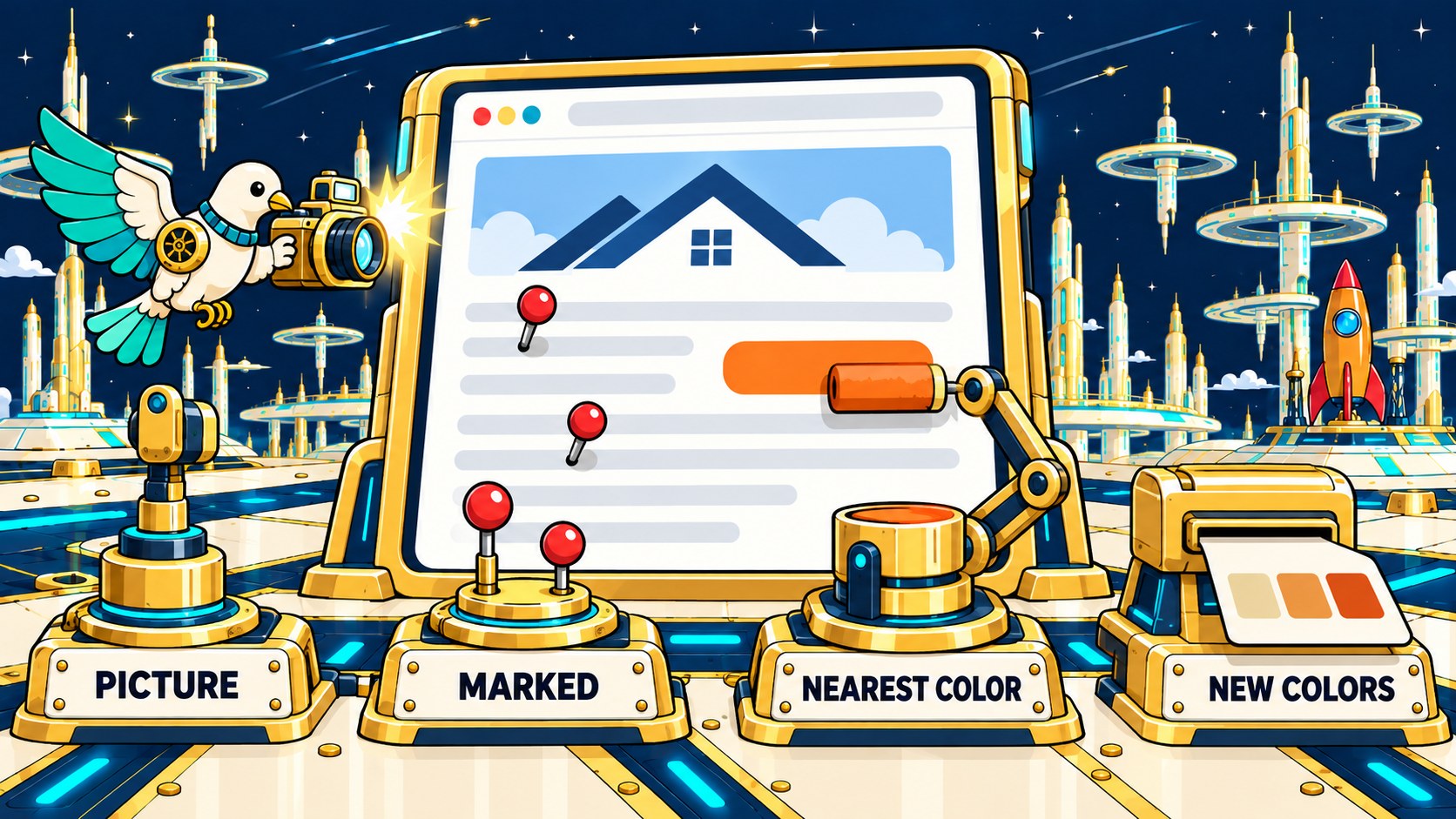
This check starts with the wall instead of the chip:
1. Type your web address. We open the page once, take a picture, and read the colors it uses. We keep the picture for a day, then delete it.
2. See your page with the problems marked. Each spot below the contrast line gets a number, right on the picture of your page.
3. Get the nearest color that passes. If your coral button fails, you get a deeper coral, not a new brand color. Drag the line across the picture to see your old page and the fixed one side by side.
4. Copy the new colors. They come as plain color codes that you or your web person can paste in.
No web address handy? Drop in a screenshot instead. It stays on your device.
What is a good contrast ratio for website text?
Black words on a white page score 21 to 1, the highest score there is. Gray words on a gray background of the same shade score 1 to 1, and nobody can read them. That number is the contrast ratio, and your text lands somewhere in between.
The Web Content Accessibility Guidelines (WCAG) are the rules most websites follow. They set three numbers you can use:
What it is and it needs at least| What it is | It needs at least |
|---|
| Body text, links, and button words | 4.5 to 1 |
| Big text: 24 pixels or larger, or bold at about 19 pixels or larger (a pixel is one dot on the screen) | 3 to 1 |
| Button edges, form borders, and focus rings (the outline that shows which button you're on) | 3 to 1 |
The checker holds every part of your page to these numbers. A banner gets the big-text number only when every word on it is big. If even one small line sits on the banner, the whole banner needs 4.5, because all of its words share one color.
Where does the 4.5 number come from?
Most color advice never tells you where its numbers come from. This one you can check yourself.
The World Wide Web Consortium (W3C), which writes WCAG, explains it in plain math. An older screen standard, ISO-9241-3, set 3 to 1 as the floor for normal vision. People with weaker eyes, about 20/40 vision, need about half again as much contrast. So W3C multiplied: 3 times 1.5 equals 4.5. W3C, citing Arditi and Faye (2004), says 20/40 is typical for many people around age 80, so the 4.5 line covers your customers with weaker eyes.
Which color rules have a study behind them?
You may have heard of the 60-30-10 rule: one main color on 60% of the page, a second color on 30%, and an accent on 10%. Many designers use it.
We looked for proof. On October 12, 2026, we searched Europe PMC, a large library of science papers, for "60-30-10" with color and design. We screened all 290 results by title, and none of them tested the rule.
Contrast is different. Researchers have tested it with real people. In one study, 136 people read two web pages, and more contrast usually made the words easier to read (Hall and Hanna, 2004). In another, 308 people tested 56 color pairs on flat screens, and the old charts made for print and tube screens didn't fit (Humar and others, 2014).
Now look at the small gray line under the roofer's phone number. Small letters need more contrast, not less: when contrast drops, people need bigger letters to keep reading at full speed (Ohnishi and others, 2020). A brighter screen helped readers more than the color order did (Buchner and others, 2009), and light words on a dark background were hardest to read in a dark room (Dobres and others, 2017).
The color rules you were taught have no study behind them. The one number that matters does, and you can check your own page against it in a minute.
Do gradients pass if both ends pass?
They don't always pass. A banner that fades from one color to another has a middle, and that's where words often get lost.
We built a test banner to catch exactly this: navy fading to yellow and back to navy, with white words across it. The navy ends are fine, 12.52 to 1. The trouble is the yellow center, right where a headline usually sits, where white words score 1.07 and almost disappear. A checker that tests only the two end colors passes that banner. This one walks the whole fade and stops at the yellow.
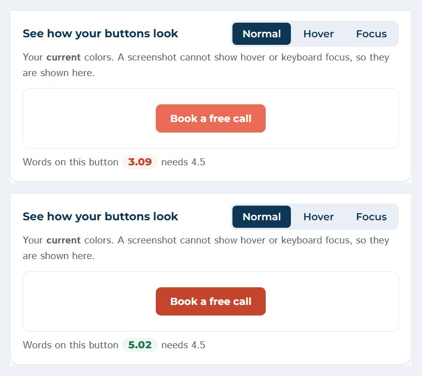
Before I offered this check to anyone, I ran it on dovewebconsulting.com. White text on our theme green scored 2.10, white on our coral scored 3.09, and the pale gray in our footer scored 1.68. We changed the green to a deeper green and the coral to a deeper coral, and white words on our buttons now score 5.02. Then we checked the blog, the contact page, and the free site analysis page, and each one came back clear.
What can't a color check tell you?
Think back to the customer in the parked truck at noon. The check can't see the sun on that windshield or how far the phone's brightness is turned up. It only does the color math. A page that barely passes, say 4.6 to 1, has almost no room left for glare, so give your words more than the minimum.
It isn't legal advice, and it isn't a full audit. It checks colors. A full audit also checks headings, image text, and keyboard use.
I haven't tested this checker on readers, so how it does with real readers is unverified. It applies W3C's math, and the evidence sits behind that math, not behind my tool.
Frequently asked questions
How do I check the colors on my website?
Type your web address into the free color check at the top of this page. It opens your page, finds the colors your text, links, and buttons use, and marks any that fall below the contrast line. You can also drop in a screenshot.
What is the 3 color rule for websites?
It's a design habit, also called 60-30-10. A main color covers most of the page, a second color covers about a third, and an accent marks buttons and links. We found no study that tests it. Whatever colors you pick, check the words on them against the 4.5 line.
What contrast ratio does website text need?
At least 4.5 to 1 for anything a customer reads: paragraphs, links, your phone number, and the words on buttons. Headlines get a lower bar, 3 to 1, once they are 24 pixels or larger, or bold at about 19 pixels. Button edges and focus rings also need 3 to 1.
Are logos exempt from contrast rules?
Logos are exempt. W3C says text that is part of a logo or brand name has no contrast requirement. Decorative text that carries no meaning is exempt, too.
Can I pull the colors from a website?
You can. This check does that when you type an address, and it also tells you which colors are too faint for the text on them. Some tools only list the colors without checking them.
Does Google have a color picker?
Google Chrome has one in its developer tools. Right-click a page, choose Inspect, and click a color square. If you know developer tools, Chrome's CSS Overview panel can also list faint text. (CSS is the code that sets a page's colors and fonts.) This check is the no-tools way to do the same thing.
Want a person to look at the rest of the page?










 1
1 3
3 4
4